Best UI/UX Practices | Part 2

There are several design rules that make our lives easy in pursuit of the perfect UI...
Welcome back to the second part of revealing the mystery behind the UI/UX designer’s deeds. So far we have determined the user’s needs, cleared the overall logic and hierarchy between the different pages and components and cut all the potential of our website to become an eye candy with the previous article – best UX principles.
Now, it’s time for the much more creative part – the visualisation. And who will be more suitable for this task than the visual designer or the User Interface designer.
Here is a list of the most fundamental things you will need to know about layouts, colors and typography in order to accomplish a beautiful and influential interface for your website. Check them out!

1. Layout & Composition
- Proximity – objects in proximity are perceived as a group.
- Similarity – objects that look alike are perceived as a group.
- Balance – balance is the visual weight distribution of objects, colors and space in your design.
- Contrast – contrast in design is an accentuation of the differences between elements. Applying contrast to a design allows you to emphasize or highlight key elements.
- Repetition – repetition strengthens a design by repeating elements throughout the entire piece. This can be a particular format, a color, a shape, a bold font, even a texture.
- White Space – white space is the absence of text and graphics between elements. It is also referred to as “negative space”. White space is important because it provides visual breathing room for the eye by making a page feel less cramped.

2. Colors and palettes
Picking color palettes is essential for the user interface. Most of the time, the main color is the color of the brand and several other colors are picked to be in contrast with the main one. A good practice is to use an online color picker or any other palette that you like. Some of the best websites for color palettes and color picking are:

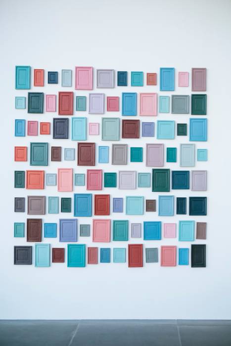
Balance is the visual weight distribution of objects, colors and space in your design.
3. Text & Typography
- Use only a single font family – Avoid combining 2 fonts from the same classification (2 serif or 2 sans-serif fonts). The reason: lack of contrast.
- Always skip a weight – When combining different font weights, choose Light and Bold (skipping Regular) or Medium and Extra (skipping Bold). The reason: contrast.
- Text alignment– Remember to align your text depending on the language and the movement of the reader’s eye. In the western world, people write and read left to right so the text should be aligned at the top left. For the languages that read right to left, such as Arabic for example, the alignment should be the opposite – right to left. We have actually done a project with Arabic language – Sterling Stamp.
- Double sizes – A good starting point is to double (x2) or scale by half (/2) your font sizes.
- Choosing fonts – Sans and serif fonts go alike. Avoid combining more than two different fonts in one design, some websites like Font Pair can show a good library of fonts that goes alike.

4. Images and Graphics
The images that are selected for the User Interface should be :
- In the project context
- In the same style as other elements
- Logically and visually connected

5. Responsive design and grid systems
As you can see the designer’s job is not easy at all, but between all these principles, laws and measures there is also room for creativity and art. Hope that this and the previous article have inspired you and provided you with new ideas and useful things about the whole process of creating the design of quality websites and apps. Don’t be afraid to express yourself every way you can and remember that the designer’s presence must remain unknown in order to be good.
Recent posts
Recent posts
You may also like
More articles in design

Who wrote this article
Learn more about the author

Penka Bineva
Junior Website Creator
/ UI/UX design enthusiast
/ fantasy novels lover
/ craft beer taster
/ digital art and craft enthusiast
/ very cat person
Comments
Would you like to share something?


