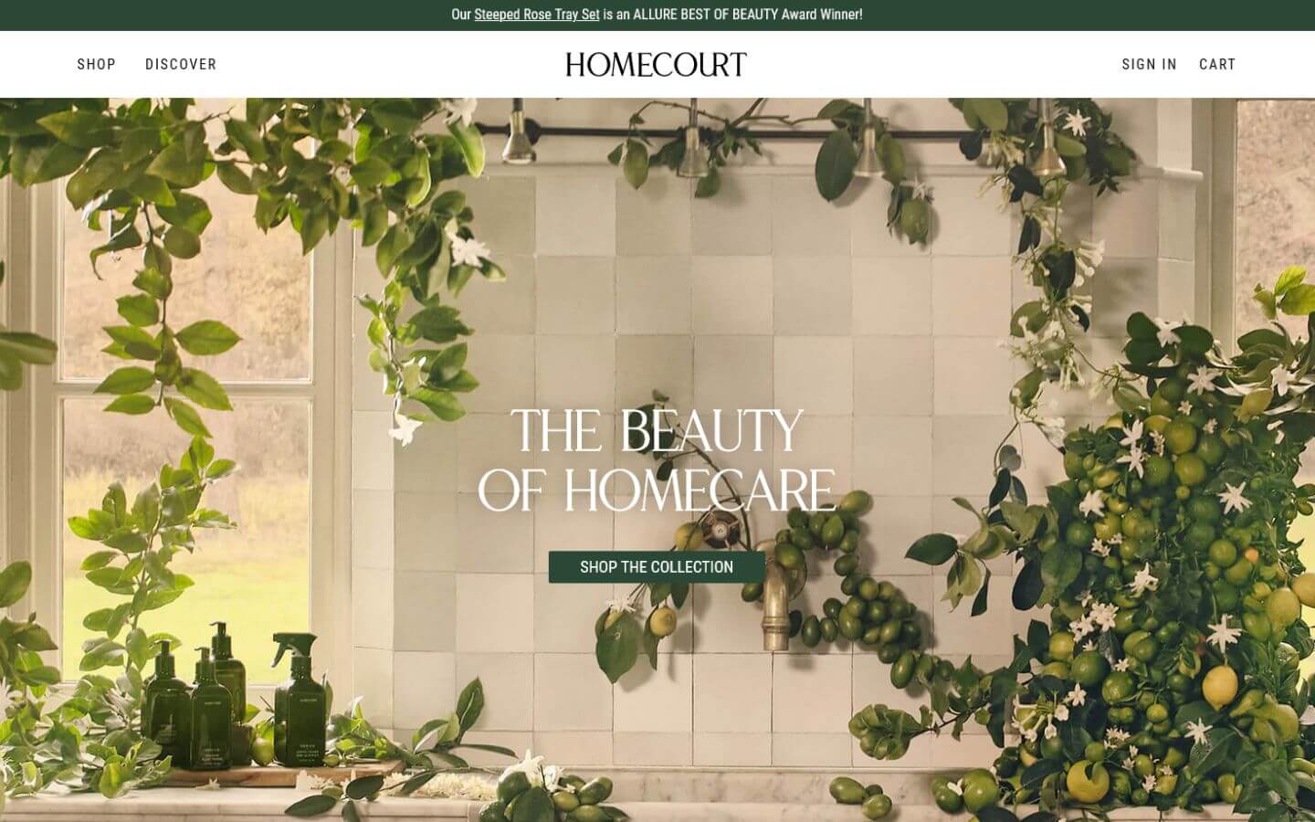
Website Analysis of Homecourt

There's always room for growth and improvement, change is constant and each day you learn something new.
Hello, YouTube World!
Our founder Polly is a great example of taking initiative.
Apart from being our CEO and Lean Master, she’s also the initiator of FEB (Female Entrepreneurship Bulgaria), a blogger at JAW with more than 10-year experience as a business and startup mentor.
Along the way, Polly has gained valuable first-hand experience in various fields she’s passionate to share with us. She’s been doing that with us at Webdesh for few years now and decided to take it to the next step so she has just started her own YouTube channel.
It’s going to be the home of sharing know-how on a variety of topics – tips and tricks about CMS website building, website creation and website analysis, business, company culture, entrepreneurship, and productivity (and maybe some travel here and there).
Having mentioned company culture, at Webdesh we highly value the transparent relationships built on trust between us and our clients. That’s why Polly will highlight what you as a client should demand from a website building service so that you can manage your expectations according to a standard.
Since few clients asked us for an honest professional opinion about their current websites, we “invented” the website analysis service where we make a detailed report on your website’s UX and UI design, SEO, speed, security, GDPR best practices, and more.
That’s why Polly is starting off her YouTube journey by analyzing a website.
Website Analysis of Homecourt
As a big Friends lover (we all are!), she set her sights on Courtney Cox’s website – Homecourt.co – The Beauty of Homecare “A new collection of luxury cleaning and household products infused with fine fragrances and skincare-grade ingredients” and more: https://homecourt.co/.
Polly loved the business and has some useful things to share about the website’s UX/UI design, responsiveness, and performance in this video.
Disclaimer: This is an opinion video. The idea and intent of this video is to give an opinion and interesting information. It is not meant to discredit or harm any business or person connected to or mentioned in this video.
A brief summary of Polly's opinion
Desktop: Sleek design, awesome HD pictures, creating a great atmosphere in a secure https:// environment
What can be enhanced?
- More white space would give the design more room to breathe;
- Pop-ups – are not an optimal UX decision and I try to avoid them;
Performance: GTmetrix – grade B.
- Insight: pay more attention to caching.
Phone Preview (iPhone 13, Safari)
What can be enhanced?
GDPR – prechecking the box of the privacy policy confirmation is not a good UX practice.
Privacy Policy – it’s a good UX practice to place the legal docs on different pages, not just as PDFs so that the user can always navigate easily with the header and the footer menu. Additionally, as these legal pages normally contain a lot of information – a way to simplify it for the user is to create links for each section. Once you click on a link for a particular section, it leads you to the information you are looking for on the exact same page. Easy-peasy!
FAQ Section: Overflow – watch out for horizontal scrolls. Here are some ideas on how:
- Avoid negative left-right margins
- When the content is wider than the screen, be careful to not have overflow of content
If you find this helpful - Subscribe to receive more useful information
Recent posts
Recent posts
You may also like
More articles in technology

Who wrote this article
Learn more about the author

Aleksandra Mitreva (Annie)
Junior Website Creator
/ Web design student 🎨
/ passionate yogi ✌
/ traveling, art, nature, hiking & animals lover
Comments
Would you like to share something?


