Web Design Training by Lori (Part 2) | Typography and Spacing

There is no right or wrong way to design your website, but there are certain rules that must never be overlooked.
Hi there! As promised in our first article on Web Design training by Lori, we are going to go more in depth about typography and how spacing works.
Typography

I will tell you a story of a young Steve Jobs and how he changed the way we understand fonts.
Most people know Steve Jobs as the guy who invented Apple. While doing some research for this article, I came across another title of his- the Godfather of fonts. But why, you may ask?…
Steve Jobs’s fascination with fonts began when he enrolled in a few calligraphy classes as a college freshman. According to his professor, it was quite odd that he was interested in this topic at the very start of this studies, since most of his colleagues were either juniors or seniors. But there he was – quiet and eager to learn. As most of you know, he dropped out of Reed College his second year, which didn’t stop him from becoming Silicon valley’s superstar and creating the Mac. When he created his first computer, he did something that was never done before – he included 10 fonts for the users to choose from. It may not seem like much from a modern perspective, but it was highly valued at this time. So that’s basically how he got named the Godfather of fonts.
Back to out topic – fonts and why choosing the right one is so important.
The typography of a website is something the user usually doesn’t even consider – there are just things that look appealing to the eye, which make you want to read something. Similar to how colours work, fonts also have a way to trick the human brain to feel certain emotions and incline it to feel a certain way – safe, secure, trusting.
Picking the font for your website is one of those teeny tiny details that really give a finishing touch to the whole picture. There’s actually a whole science behind fonts. Would you like to know more about it? Tell us!
We mentioned in our previous article on the principles that the best fonts to use today are Roboto, Ubuntu and Helvetica.
In general, you will want to stick to using a maximum of 3 different readable fonts in a maximum of 3 point sizes. A good rule of thumb when changing font sizes is to double or use half of the point size you are using, for example if your headings are 30px, make the body text 15px and vice versa. If you really want to put an accent on something and make it super big, triple or quadruple the body font size – just remember – no more than 3 point sizes in total.
For some extra tips on how to really make fonts work, check out this video, which was generously forwarded to us by the talented Kaloian Toshev a.k.a MZK.
Spacing and how it works

The last thing we talked about in the web training is what element spacing is and how it works.
In our first article we’ve talked about the general idea of spacing, now let’s tackle all parameters individually!
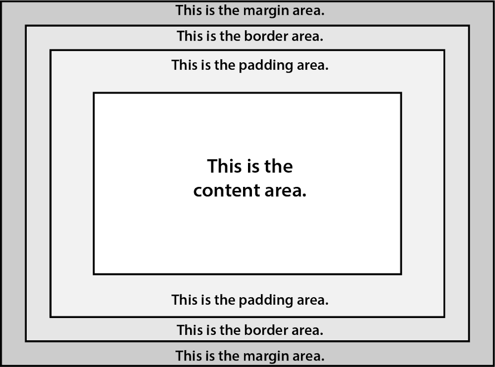
- Starting with the margin area, it’s a transparent white space outside the box that distances the box from its neighbouring elements. In short, it’s the last and furthest layer of space that surrounds the content area, i.e. an element with a margin-bottom of 20px will be spaced 20px away from the element below it.
- Next comes the border area- the size of the outline that surrounds the box. The border area expands the overall dimensions of an element. It can either be solid and coloured, or just a transparent line that frames the content to look a certain way.
- The padding area is the space that comes between the border and the content area. It forces a distance between the content area and the visible or invisible boundary of the box (the border) that dictates the element’s shape.
Finally, the content area – I think all of us can imagine what this is by now. - The content area stands in the centre of the spaces surrounding it and is essentially the reason we need to use them – to make it as close or as far away from other elements a.k.a content areas.
Here is an image for reference:

Overall, the best advice our talented designer Lori has to offer: “Let the design breathe!”

To conclude, I would like to think that there is no right or wrong way to design your website, since web design is its own kind of art, but I do think there are certain rules that must never be overlooked and must always be followed. Well, at least to an extend where your website isn’t too cluttered, messy and chaotic and is in fact a welcoming, pleasant and informative side of the Internet.
If you would like to read more about principles in web design, check out part 1 of our article!
Recent posts
Recent posts
You may also like
More articles in design
Who wrote this article
Learn more about the author

Mirela Vaseva
Website Creator & Head of QA
/ IT, Software Engineering graduate 💻
/ good music, horror films, detective novels and delectable food 👌
/ YouTube videos junkie 🎥
/ animals, nature, water lover 🐱
Comments
Would you like to share something?


